Diagrams
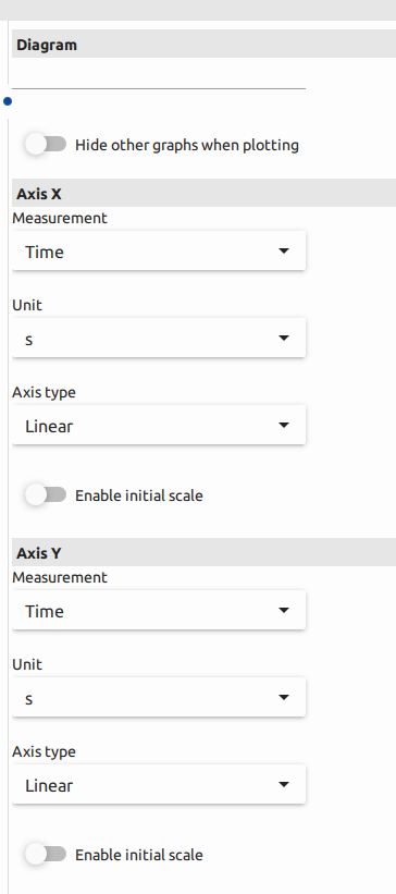
The "Diagram" tab offers users a powerful and flexible tool for creating various diagram combinations by customizing X and Y axes with different parameters. This feature provides extensive possibilities for visualizing and analyzing test data. Here's a breakdown of the key features available in the "Diagram" tab:
-
X and Y Axis Selection
Users can select from a pool of six X-axis and six Y-axis parameters. This allows for a wide range of combinations, making it possible to examine various relationships and trends in the data.
-
Linear and Logarithmic Scaling
Users have the option to adjust the scaling of both X and Y axes. Linear scaling is ideal for most data, while logarithmic scaling is valuable for visualizing exponential or non-linear relationships.
-
Enable Initial Scale option
"Enable Initial Scale" is a setting that can be particularly useful in data visualization when dealing with diagrams that have both X and Y axes. It affects how the data is initially scaled and displayed on the diagram, and here's an explanation of how it works for both axes:
-
X-Axis (Horizontal Scale):
Enabling initial scale on the X-axis ensures that the horizontal scale, which typically represents an independent variable or parameter, is initially displayed in a way that fits the data within the diagram. It allows the software to automatically adjust the range of values on the X-axis to accommodate the data points being plotted. This can prevent data from being squished or truncated when the initial diagram is displayed.
-
Y-Axis (Vertical Scale):
On the Y-axis, enabling initial scale means that the vertical scale, representing the dependent variable or measurement parameter, is also scaled in a way that best fits the data initially. This prevents data from getting compressed or stretched unnaturally, ensuring that the Y-axis accurately represents the data range.
Overall, enabling initial scale for both the X and Y axes helps optimize the initial presentation of data on the diagram. It ensures that the diagram effectively displays the full range of values without distorting or misrepresenting the data, making it easier for users to interpret and draw insights from the visual representation of their test results.
-
Units Change
Absolutely, the ability to change units in diagrams is a valuable feature for users, allowing them to tailor their data representation to their specific preferences and standards. Here's an expanded explanation:
-
Units Change in Diagrams:
The "Units Change" feature in diagrams provides users with the flexibility to adjust the units displayed on the axes. This means that users can modify the labels and scaling to match their preferred measurement units, standards, or reporting conventions. It serves several important purposes:
-
Alignment with Standards:
Users can ensure that the data in their diagrams complies with industry standards or specific reporting requirements. This is particularly crucial in fields where data conformity is essential, such as materials testing for quality control.
-
Clarity and Interpretation:
Customizing units helps make the data more understandable and relatable to the audience. It can improve the clarity of the diagram, making it easier for users to interpret and communicate the results effectively.
-
Flexibility:
Different analyses or comparisons might require data to be presented in different units. With the ability to change units in diagrams, users have the flexibility to adapt their data visualization to the specific needs of each analysis or presentation.
-
Preferred Formats:
Users can work with the units that they are most comfortable with or that are commonly used in their field. This minimizes the risk of errors caused by working with unfamiliar units.
By allowing users to customize units in diagrams, the application ensures that data representation is both versatile and meaningful. Users can create diagrams that align with their standards and preferences, which enhances the utility and accuracy of the visualized data. This feature aids in better understanding, analysis, and communication of test results.

At the end of this section, users have the option to incorporate initial data into their diagrams, as illustrated: